


版式:The Foundation Network AssCO11
评分模块与著作信息模块:
这是由 Liurd 为2023设定竞赛的参赛设定“打破雪景球”而制作的版式。
在你的作品开头添加如下语法以应用此版式:
[[include :scp-wiki-cn:theme:tfnac]]
the Foundation Network assCO11 版式是一个 Sigma+ 版式。
示例
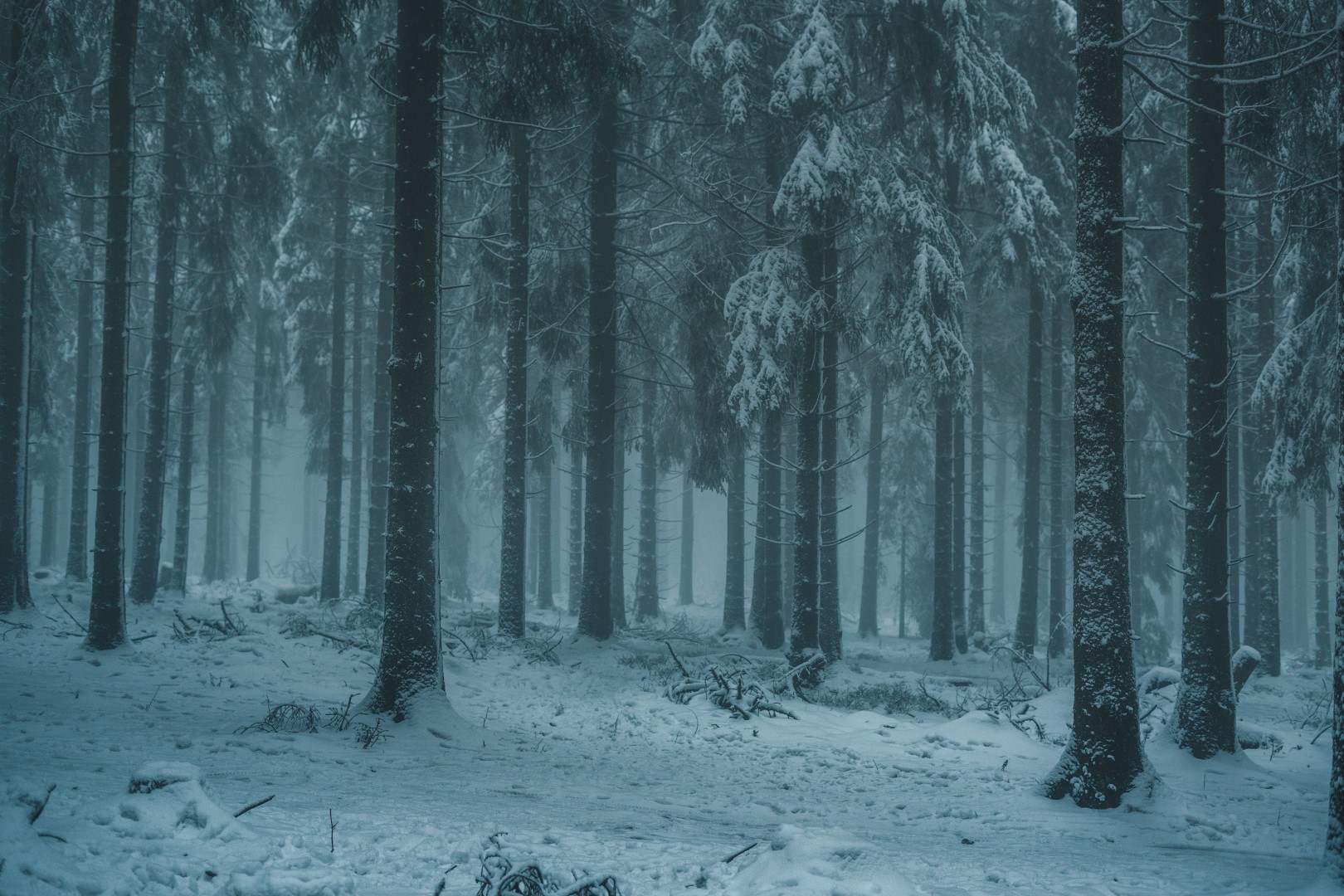
好看的图片,来自此处
可通过五个连字符“-----”创建水平分割线。若它未被放在其他部件(诸如引用块)中,则会左右延伸贯穿页面。这种将文件分割为多个部分的线就是分割线。
标题可通过在一行字起始处输入 1 至 6 个加号“+”来创建。
此为分页(tab view)。
看,这有更多文字。
多么精巧绝伦。
这是一个长的 tab,它有很多文字。
这是一个长的 tab,它有很多文字。
这是一个长的 tab,它有很多文字。
这是一个长的 tab,它有很多文字。
这是一个长的 tab,它有很多文字。
这是一个长的 tab,它有很多文字。
这是一个长的 tab,它有很多文字。
这是一个长的 tab,它有很多文字。
这是一个长的 tab,它有很多文字。
这是一个长的 tab,它有很多文字。
这是一个长的 tab,它有很多文字。
这是一个长的 tab,它有很多文字。
这是一个引用块,在一行字的起始处加上“> ”来创建。
更多文字
一条分割线
嵌套引用块
| 这是 | 表格 |
|---|---|
| 你应该老早 | 就知道怎么 |
| 做这个了吧 | |
打碎雪景球
作者: Liurd
[[div class="credits"]]
[[div class="series"]]
打碎雪景球
[[/div]]
[[div class="author"]]
作者: [[*user Liurd]]
[[/div]]
[[/div]]
源代码:
:root {
    --header-title: "S · C · P";
    --header-subtitle: "控制,收容,保护...?";

    --sp_header-logo: linear-gradient(to right, #444, #fff);
    --sp_header-logo-size: 7.5rem;
    --sp_header-height: 7.5rem;

    --sp_header-gradient-top-color: #333;
    --sp_header-gradient-top-stop: 0;
    --sp_header-gradient-bottom-color: #2a2a2a;
    --sp_header-gradient-bottom-stop: .99;

    --sp_diagonal-stripes-color: #00000000;

    --sp_top-bar-height: 2.25rem;
    --sp_top-bar-gradient-top-color: #00000000;
    --sp_top-bar-gradient-bottom-color: #00000000;

    --sp_top-bar-link-color: #eee;
    --sp_top-bar-link-hover-color: #fff;
    --sp_top-bar-link-hover-background: #666;

    --sp_dropdown-background: #666;
    --sp_dropdown-link-color: #fff;
    --sp_dropdown-link-hover-color: #000;
    --sp_dropdown-link-border: 0.2rem solid #000;
    --sp_dropdown-link-hover-background: #bbb;

    --sp_rate-module-background: #00000000;
    --sp_rate-module-sub-color: #333;
    --sp_rate-module-text-color: #333;
    --sp_rate-module-button-color: #333;
    --sp_rate-module-button-background: #00000000;
    --sp_rate-module-button-hover-color: #000;
    --sp_rate-module-button-hover-background: #ddd;

    --sp_tab-text-color: #eee;
    --sp_tab-background: #333;
    --sp_tab-border-color: #999;
    --sp_tab-hover-text-color: var(--sp_tab-text-color);
    --sp_tab-hover-background: #444;
    --sp_tab-hover-border-color: #bbb;
    --sp_tab-selected-text-color: #fff;
    --sp_tab-selected-background: #666;
    --sp_tab-selected-border-color: #ddd;

    --sp_hovertip-background: #eee;
    --sp_hovertip-border: 0.1rem solid #333;
}

#container a {
    transition: color 0.25s, background-color 0.1s;
}

#header {
    grid-template-rows: auto auto 2fr 1fr auto auto;
    grid-template-columns: var(--sp_area-comp-margin) 2fr 1fr var(--sp_area-comp-margin);
}

#header:before {
    mask-image: url(https://nu-scptheme.github.io/Black-Highlighter/img/logo.svg);
    mask-position: center;
    mask-size: contain;
    mask-repeat: no-repeat;
    -webkit-mask-image: url(https://nu-scptheme.github.io/Black-Highlighter/img/logo.svg);
    -webkit-mask-position: center;
    -webkit-mask-size: contain;
    -webkit-mask-repeat: no-repeat;
}

#header h1 a:before, #header h2 span:before{
    text-shadow: none;
    background-image: linear-gradient(to right, #fff 60%, #bbb);
    background-clip: text;
    -webkit-background-clip: text;
    color: transparent;
}

#header h1 {
    position: relative;
}

#header h1 a {
    position: absolute;
    bottom: 0.5rem;
}

@media (min-width:768px) {
#header {
    grid-template-areas:
        ". . . ."
        ". search login ."
        ". h1 top-bar ."
        ". h2 . ."
        ". . . .";
    grid-template-columns: var(--sp_area-comp-margin) 1fr 1fr var(--sp_area-comp-margin);
    grid-template-rows: auto auto 2fr 1fr auto auto;
}
#top-bar {
    position: absolute;
    top: 3.5rem;
    height: var(--sp_top-bar-height);
}

#side-bar {
    position: sticky;
}
}

@media (max-width:768px) {
#search-top-box {
    justify-content: flex-end;
}
}

#search-top-box-input {
    border: solid 2px #666;
    border-radius: 0;
    color: #ccc;
    background-color: #333;
    box-shadow: unset;
    transition: color 0.25s, background-color 0.1s;
}

#search-top-box-input:hover, #search-top-box-input:focus, #search-top-box-input:focus-within {
    border: solid 2px #fff;
    color: #fff;
    background-color: #666;
    box-shadow: unset;
}

#search-top-box-form input[type=submit] {
    border: solid 2px #666;
    border-radius: 0;
    color: #fff;
    background: #333;
    box-shadow: unset;
    transition: color 0.25s, background-color 0.1s;
}

#search-top-box-form input[type=submit]:hover {
    border: solid 2px #999;
    color: #fff;
    background: #666;
    box-shadow: unset;
}

#top-bar {
    padding-inline: 0;
}

#top-bar div[class*="top-bar"] > ul {
    justify-content: center;
}

#top-bar div[class*="top-bar"] > ul > li {
    flex-grow: 1;
}

#top-bar :is(.top-bar, .mobile-top-bar) ul li ul {
    border: 0.2rem solid #000;
    border-top: unset;
    box-shadow: unset;
    padding: 0;
}

#top-bar :is(.top-bar, .mobile-top-bar) ul li ul li a {
    padding: 0.5em 0.675em;
    text-align: center;
}

#side-bar {
    background: linear-gradient(#ddd, #aaa);
    border: 0.1rem solid #000;
    max-height: 100vh;
    overflow-y: scroll;
    top: 0;
    scrollbar-width: thin;/*for-moz*/
}

#side-bar::-webkit-scrollbar {
        width: 0.5rem;
}

#side-bar img {
    filter: grayscale(100%);
}

#side-bar .collapsible-block {
    filter: grayscale(100%);
}

#side-bar .side-block {
    background: transparent;
    padding: 0;
    border: unset;
    box-shadow: unset;
    border-radius: 0;
}

#side-bar .menu-item {
    display: flex;
    justify-content: center;
}

#side-bar .menu-item p {
    display: inline-flex;
    justify-content: center;
}

#side-bar .menu-item a {
    display: inline-block;
    flex-grow: 1;
    text-decoration: none;
}

#side-bar .heading {
    background: #fff;
    color: #000;
    text-align: center;
    font-size: 1rem;
    padding: 0.5rem;
    border-color: #bbb;
    border-width: 0.2rem 0;
    margin: 0.5rem 0;
}

body {
    background: linear-gradient(#bbb, #eee);
    background-attachment: fixed;
    color: #000;
}

#page-title, #meta-title {
    color: #000;
}

.page-rate-widget-box {
    box-shadow: unset;
}

#page-content .rate-box-with-credit-button {
  box-shadow: unset;
}

#page-content div.creditButton p a {
    border: unset;
    border-inline-start: unset;
}

#page-content .creditButtonStandalone p a.fa.fa-info {
  display: inline-block;
  color: inherit;
  background: transparent;
  box-shadow: unset;
}

#page-content .creditButtonStandalone p a.fa.fa-info:hover {
  color: #333;
  background: #bbb;
  box-shadow: unset;
}

#content-wrap h1 {
    color: inherit;
}

#main-content a:not(#u-sb-button, #u-no-more-menu, .page-rate-widget-box a, .creditRate a, .printuser.avatarhover a:first-child, ul.yui-nav a, a.newpage, .page-options-bottom a) {
    color: #333;
    text-decoration: underline dotted 1px;
    text-underline-position: under;
}

#main-content a:not(#u-sb-button, #u-no-more-menu, .page-rate-widget-box a, .creditRate a, .printuser.avatarhover a:first-child, ul.yui-nav a):hover {
    color: #666;
}

#page-content a:not(#u-sb-button, #u-no-more-menu, .page-rate-widget-box a, .creditRate a, .printuser.avatarhover a:first-child, ul.yui-nav a, a.newpage):visited {
    color: #603;
}

#content-wrap a.newpage {
    color: #326;
    text-decoration: underline dotted 1px;
    text-underline-position: under;
}

#side-bar a,#side-bar a:visited,#side-bar a:hover {
    color: #333;
    text-decoration: underline dotted 1px;
    text-underline-position: under;
}

#side-bar a:hover {
    background: #333;
    color: #fff;
}

.yui-navset .yui-nav, .yui-navset .yui-navset-top .yui-nav {
    border: unset;
}

.yui-navset.yui-navset-top .yui-nav li {
    flex-grow: 1;
    transition: flex-grow 0.25s;
}

.yui-navset.yui-navset-top .yui-nav li.selected {
    flex-grow: 2;
}

.yui-navset .yui-content, .yui-navset .yui-navset-top .yui-content {
    border:none;
    border-bottom: .2rem solid #333;
    background: linear-gradient(to right, #f0f0f0, #e9e9e9);
}

.scp-image-block {
    border-width: 0.2rem;
    box-shadow: unset;
    background: linear-gradient(#aaa, #ddd);
    padding: 4px;
}

.scp-image-block .scp-image-caption {
    background: transparent;
}

#toc, .code, blockquote, div.blockquote {
    background: linear-gradient(to right, #f0f0f0, #e9e9e9);
    border: 0.1rem solid #333;
}

div.wiki-note {
    width: auto;
    margin: 0.5rem 2rem;
    border: unset;
    text-align: center;
    background: #fff;
    padding: 0.2rem;
    box-shadow: 0 5px 15px #0005;
}

table.wiki-content-table {
    background: linear-gradient(to right, #f0f0f0, #e9e9e9);
    border: 0.1rem solid #333;
}

table.wiki-content-table th {
    background: #333;
    color: #fff;
}

.credits {
    display: flex;
    border: 0.1rem solid #333;
    background: linear-gradient(to right, #f0f0f0, #e9e9e9);
    justify-content: center;
    align-items: center;
    padding: 1rem;
}

.credits .series {
    font-size: 1.5rem;
    font-weight: bolder;
    border-right: 0.2rem solid #333;
    padding: 0.5rem;
    padding-right: 1rem;
}

.credits .author {
    text-align: center;
    font-size: 0.8rem;
    font-weight: bolder;
    height: fit-content;
    margin-left: 0.75rem;
    padding: 0.25rem;
    flex-grow: 1;
    background: #fff;
}

.bibitems, .footnotes-footer {
    background: linear-gradient(to right, #f0f0f0, #e9e9e9);
    border-left: 0.2rem solid #333;
    position: relative;
    padding: 0.2rem 0.5rem;
    margin: 2rem 0;
}

.bibitems .title, .footnotes-footer .title{
    position: absolute;
    bottom: 100%;
    display: inline-block;
    background: #333;
    color: #fff;
    padding: 0.2rem 0.5rem;
    left: -0.2rem;
    margin: 0;
}

.page-options-bottom {
    text-align: center;
    height: auto;
    display: flex;
    flex-wrap: wrap;
}

.page-options-bottom a {
    color: #333;
    display: block;
    flex-grow: 1;
    padding: 0.2rem 0.5rem;
    text-decoration: none;
    border-bottom: 0.1rem dotted currentcolor;
    margin: 0.1rem;
}

div.buttons input, input.button, button, file, a.button,.owindow .button-bar a {
    border: 0.1rem solid #333;
    flex-grow: 1;
    color: #fff;
    background: #333;
    padding: 0.2rem 0.5rem;
    cursor: pointer;
    margin: 0.1rem;
    transition: color 0.25s, background-color 0.1s;
}

div.buttons.alignleft {
    display: flex;
    flex-wrap: wrap;
}

#top-bar .open-menu a {
    border: 0.2rem solid #333;
    border-radius: 0.2rem;
    background: #666;
    color: #fff;
}

#top-bar .open-menu a:hover {
    box-shadow: unset;
    background: #333;
    color: #ddd;
}

.owindow.owait .content{
    background: radial-gradient(circle, #aaaaaa88, #aaaaaa88),
    radial-gradient(circle, #666 , #666);
    background-size: 30px 30px;
    background-position: 45% bottom, 55% bottom;
    background-repeat: no-repeat;
    animation: background-position 0.5s alternate infinite;
    padding-bottom: 40px;
}

@keyframes background-position{
  0%{
         background-position: 45% bottom, 55% bottom;
  }
  100%{
         background-position: 55% bottom, 45% bottom;
  }
}